What’s the first thing you notice when you meet someone new?
Although our first impression might be different, a survey shows that the majority will first notice the smile or facial expression.
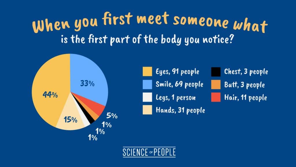
Image source: Science of People
It’s the same when we see a website. The header (which is the “face” of a website) is the first thing we notice.
And according to research, 75% of users admit to making judgments about a company’s credibility based on their website’s design.
It means that if you neglect your header design, there’s a high chance that you’ll start losing your credibility.
Therefore, it’s crucial for you to ensure your header looks nice and works well.
You’ll discover some fantastic examples of website headers and plenty of graphic examples throughout the article.
But before we move to the best practices, let’s take a quick look on what’s website header.
What is a Website Header?
A website header is a navigation menu that appears on top of your page. It’s the first impression that your website gives to your visitor.
Whether it’s a hiring process or a business owner looking to cooperate, first impressions can be key to a successful interaction.
Same goes for the website. A strong first impression will help you to develop customer relationships and make sales. Therefore, it’s crucial for you to present all of the necessary information where visitors expect to see it.
Generally, a website header contains:
- Logo
- Navigational tags
- Login/Shopping cart
- Contact number
- Social media icons that link to your social media channels
- Call-to-action (CTA)
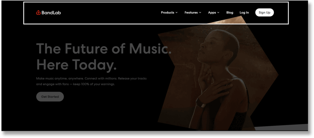
Here’s an example of a website header from Bandlab:
While there are lots of elements, this doesn’t mean that you need to include all these elements in your header.
Remember this crucial design rule: Simplicity
The more objects you have on your website,
the harder it is to concentrate on the key elements.
Hence, you should decide what to be included in the header strategically.
And one of the best ways is to check out your top competitors. See how they arranged their header, and what are the crucial elements they include (but don’t copy exactly)
Best Website Header Design Practices and Examples
Okay so now you’ve understood what’s a website header, let’s now deep dive into top 7 best website header design practices!
Follow Visual Hierarchy
There’s a reason for every page to exist, be it signing up for a free demo or asking visitors to contact us.
To guide your visitors to desired actions, you should follow a visual hierarchy when designing your header.
In simple terms, visual hierarchy is the principle of arranging elements to show their order of importance. When your header design is following a visual hierarchy, your visitor will be able to perceive the content you want to deliver without additional effort.
Let’s look at how Monday.com does this.
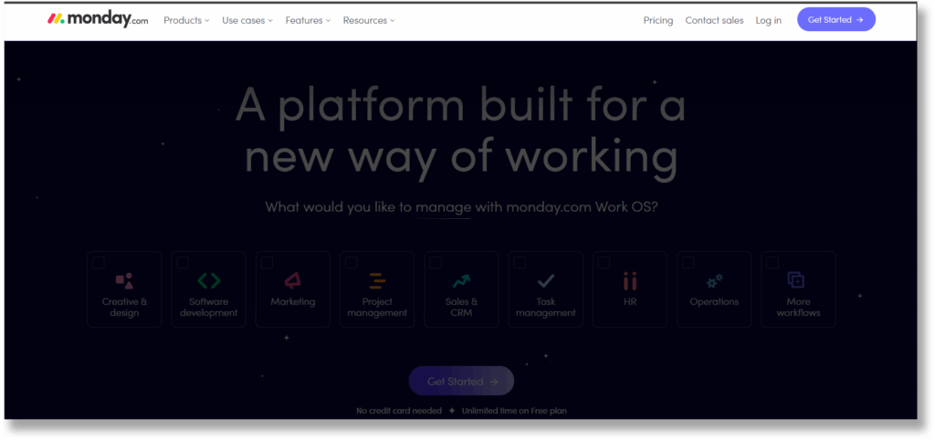
Notice that the logo is placed at the far-left corner of the header, followed by the navigation links. The logo and navigation links are put together as they’ve similar functions, which is to allow visitors to navigate through other contents of the website.
Moving to the right, we can see links like “Pricing”, “Contact sales”, “Log In” and “Get Started” CTA. They’re grouped together as these are mainly for visitors that are interested in getting the software.
If we move to its mega menu, you’ll notice the same visual hierarchy is applied here. It’s very simple to browse the header content due to the drop-down menu’s layout and navigation structure.
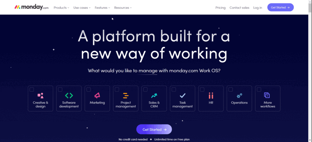
By designing it this way, visitors are able to know what your website or business is about without any difficulties.
If you’re unsure of how to arrange your header, here are some best practices for you:
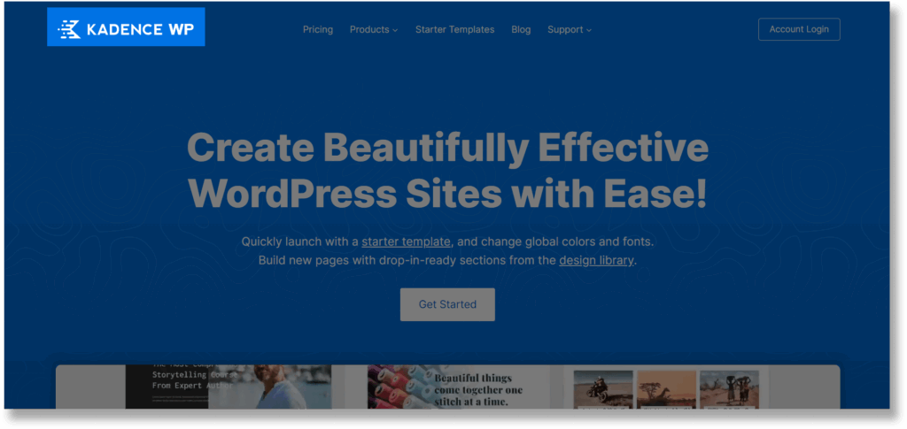
Logo – it’s recommended to put it on the left compared to the centre as it’s easier for visitors to remember your brands like how Kadence WP does it.
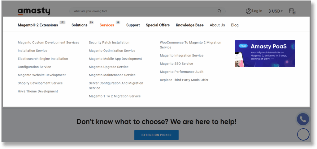
Navigation links – Avoid putting too many links as it will overwhelm your visitors. If you’ve a lot of services and content on your website, consider having a mega menu like Amasty. You can also add hover effects to guide users as they navigate.
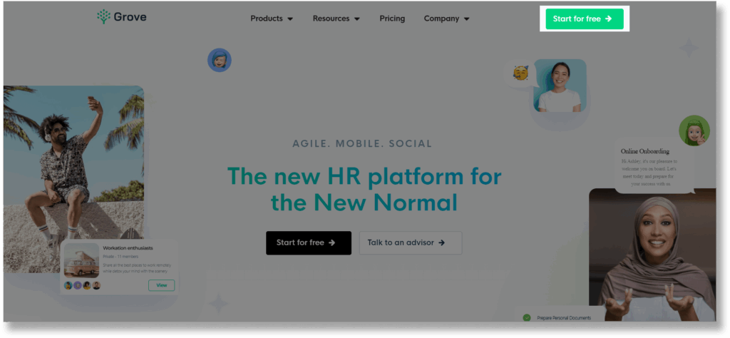
CTA – Highlight your call to action by adding a strong contrast between CTA and your background like how Grove does it.
Use Call-to-Action Wisely
According to Unbounce, more than 90% of your visitors who read your headline also read your CTA copy.
Imagine you have a stunning home page.
You have all the information about your products and beautiful images that showcase your product, but you don’t have a CTA button.
Your visitors have read your copy, and are interested in engaging with your brand, but when they look for a CTA button to learn what to do next, they can’t find one. Hence, they may end up leaving your website.
That’s why you need a CTA button to lead your visitors to make a decision.
CTAs are signposts telling users what they need to do next. Without clear CTAs, users may struggle to see the route to buying a product or signing up for a service.
If you want to craft an effective CTA, here are some useful tips for you to consider:
- Use a strong command verb like “buy”, “visit”, “get”
- Add something unique about your product instead of just using a single word. For example, “get free updates” or “contact our payment experts”
- Add a contrasting colour to your CTA button so that really stands out.
- Create a sense of urgency by using the word “now”, “today”, “only”, etc.
- Use 1st person if possible. For example, try using “get my free template” instead of “get your free template”
- Apply visual hierarchy if you have two CTAs. Make your main CTA stand out by making the less important button less attention-grabbing. For example, you can use grey scale buttons or monochromatic colours.
Let’s take a look at how Hulu crafts its CTA. Notice how they’re making a sharp contrast between the dimmed background and the colour of the CTA button. The sharp green of the CTA draws your attention.
Contact us today to tell us more about your business and start designing your custom website!

In terms of the CTA words, instead of just having a sign-up button, they highlight the value provided to their visitors by mentioning “get the disney bundle”.
Therefore, a really effective CTA will grab visitors’ attention, piquing their interest, and eloquently guiding them through the signup process.
If you don’t have any idea to write CTA, here’s a great list of CTA you can refer to:

Consider Transparent Header when Using Stunning Image
Usually, a standard website clearly defines section borders for visitors to understand the starting and ending points of a section. However, it’s not necessary to do this for the header.
In fact, transparent headers have become one of the important website header design trends in recent years.
You can consider a transparent header background if you want to maximise the exposure of your image, videos, or other designs.
Here’s a great example from Build With Flow by Neftali Loria.

But one thing to be noted is that for the website header elements to be easy to locate and use, they need to be visible at all times, so colour contrast is important.
By using a transparent header background, you’ve to be careful and make sure the content of your header can be seen clearly when visitors are scrolling your page.
One of the solutions is to add a solid background to your header when visitors scroll down the page like how Effective Data Storytelling did it.

Put Your Shop at the Top!
If you’ve an e-commerce store, you should make your visitors navigate your site easily so that they are encouraged to make purchases. After all, that’s the reason they visit your site!
One of the ways is to list out the categories of your products and make them stick on top of your website (more about this later), like how Asos did it.
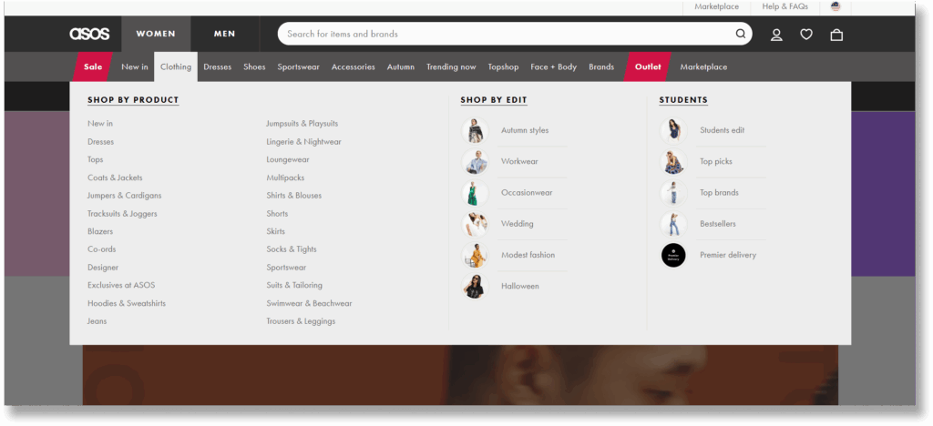
Notice how they arranged the categories of their products and split them by gender, which makes it very convenient for visitors to click on them straight away.
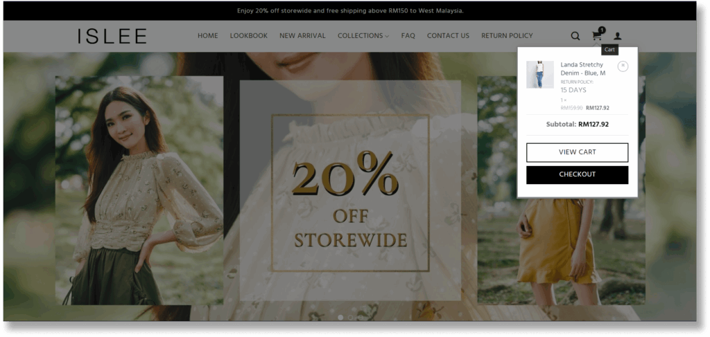
Besides, you should also add the shopping cart on your header so that visitors can complete their purchase instantly within a single click. This also helps to reduce the occurrence of abandoned carts.
You can also consider adding a hover function to the shopping cart so that users can see what’s in their basket without clicking through, like how Islee did it.
Create Memorable Website That Sells
Contact us today to tell us more about your business and start designing your custom website!
Add Notification Bar to Capture More Leads
Have you ever wondered why big brands like Nike use a website notification bar to announce just about everything?
Needless to say, it’s more effective compared to promotional emails or flyers as it’s the first thing your visitor will read when they land on your site.
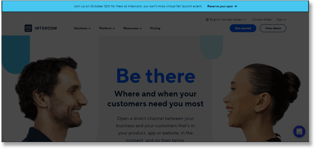
A website notification bar is most commonly placed at the top or bottom of the screen to draw visitors’ attention to a specific update or message.
It’s also meant to draw attention to something new, important, and/or exciting. Here’s a great example from Intercom.
If you’re not sure how you can utilise the website notification bar for your business, take a look at some of the benefits:
- Announce offers or campaigns such as free shipping vouchers or discount offers. This is useful if you’re running an e-commerce store
- Capture more leads by asking visitors to subscribe to your email or get your special promotions
- Promote an upcoming event such as a webinar, fundraising events, summit, etc
- Share new features or product launches to drive awareness
While a notification bar is very useful, you still want to make sure you’re designing it correctly. Here are some best practices and examples for you:
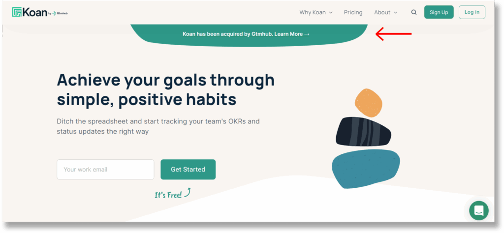
Keep it short and sweet. Avoid nonsense and straight to the point like Koan.
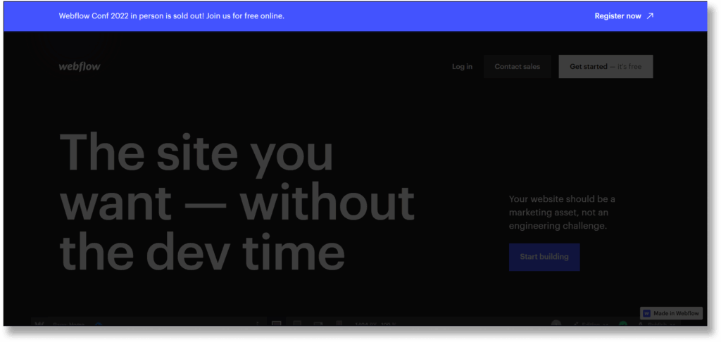
Make your notification bar contrast with the background colour so that it stands out. Here’s an example from Webflow.
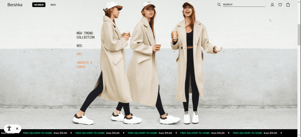
Consider sliding notification bars like Nike and Bershka if you want to make more promotions.
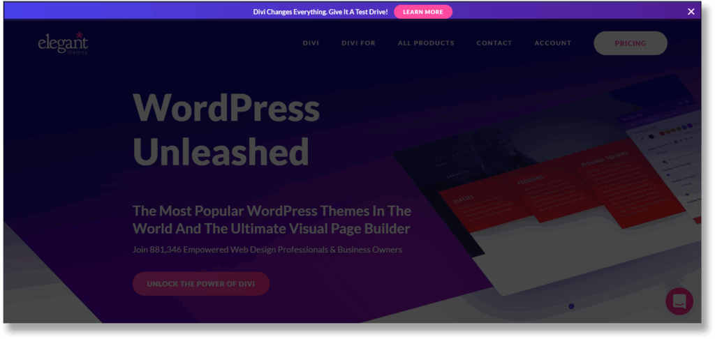
Add a link or CTA button to get the visitors to take action. You can either use a link text with bold or a button to achieve this. Here’s an example from Elegant Themes that uses a CTA button.
Create Custom Design for Mobile Devices
As mobile-friendliness has become one of the most crucial Google search ranking factors, it’s vital for you to ensure your website stays cool on mobile.
This doesn’t mean that you’ve to remake your header. It’s just that you should make it responsive and user-friendly.
If you don’t make your header responsive, it will be very difficult for users to navigate to other pages.
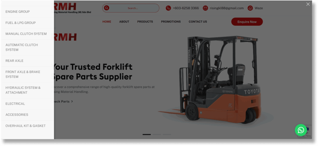
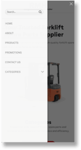
Let’s look at an example for one of our client, a forklift spare parts and accessories supplier. Notice that the website is a using two-tiered header.

Due to our client has many forklift spare parts and accessories, we helped them to categorise their products in the left sidebar menu.
We also ensure that the mobile view is responsive and user-friendly.
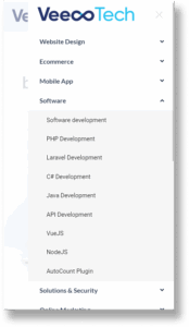
Another example is from VeecoTech. Notice that it has a two-tiered header with a mega menu. Here is how the header looks on the desktop.

Since there are so many links in the header, it wouldn’t be able to fit into the header of a mobile site. So, it’s using a hamburger menu on a mobile site like this:
In short, you should make your website header responsive. The best way is to consider a hamburger menu (either left or right) that allows your visitors to navigate easily.
Make Sticky Navigation Menu
A sticky menu is a fixed navigation menu on a webpage that remains visible and in the same position as the user scrolls down and moves about a site.
In fact, this is already one of the website design standards.
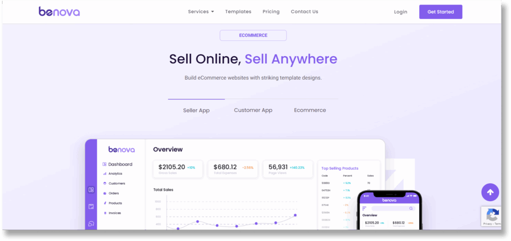
For example, Benova is using the sticky navigation menu.
While you might think that this tip sounds simple, yet it really makes an impact on your user experience.
When your website doesn’t stick when visitors are scrolling a page, they need to scroll back again to navigate to other pages.
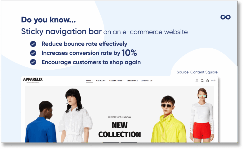
A study from Content Square found that by introducing a sticky navigation bar on an e-commerce website, the visitors are paying more attention to the individual products on the pages. This has led to a huge reduction in bounce rate, and the conversion rate has increased by 10%!
Another survey also shows that 38% of customers insist that when a website is easy to navigate, they are more likely to shop there again in the future. By making the navigation menu sticky, you’re actually making your visitor navigate your website easier and faster.
This is exactly the purpose of sticky navigation: to help people explore your website in a comfortable and controlled manner.
Now you’re aware of the importance of a sticky header. Here are some useful tips on how to design sticky headers to prevent them from negatively impacting your user’s experience.
- Shrink them up when the visitor starts to scroll.
- Create a strong contrast between the header and content so visitors know where one ends and the other begins.
- Keep the animation small
Conclusion
In summary, your website header should be unique and easy to read as it’s the first thing your visitors notice when they reach your page.
We’ve also walked through the essential practices to enhance your website header design.
I hoped this guide helped show you how you can improve your header design😄
Feel free to share it to your friends or let me know what’s your thought by leaving a comment below right now.
Contact us today to tell us more about your business and start designing your custom website!