It all began with a video call, behind the screen we saw 2 beautiful people excited to embark on a business adventure of self-heating hot pot noodles.
The Warmth of RubineS
We were so inspired by the bright nature of the 2 people we met in the initial meeting that we decided to make them the face of their logo in one of the suggested concepts.
“You have inspired us in the way we look like, we are the brand now” – Ruby (Founder of RubineS)
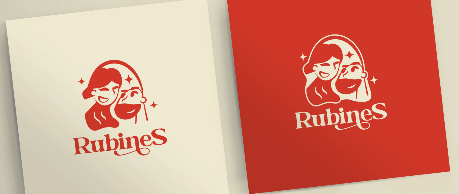
This is why RubineS’ logo features a simple yet profound silhouette of two faces looking at each other, as this symbolises the founders, a loving couple, nurturing and warm. It also represented the connection between people through food.
Wavy stripes in the woman’s hair evoked the delightful scent of cooking while surrounding stars conveyed the magic of culinary experiences.
Notably, this logo was created with curved lines, which conveyed a sense of comfort and enclosure, thus enhancing the feeling of warmth and hominess associated with the brand.
Complementing these elements is the “RubineS” wordmark in Glamsy font, with serifs for a friendly and inviting appeal, reinforcing the brand’s comfort and homey nature.
Colouring Deliciousness
The colours for RubineS were chosen based on their pursuit for creating a home-style familiar-like
taste. The vibrant colours lean towards a warm tone – giving a sense of warmth, and is also a more
natural colour which connects to home, fostering thoughts of inviting dishes. RubineS does not use
a full-white colour but always an off-white cream, eggshell beige which is more embracing.
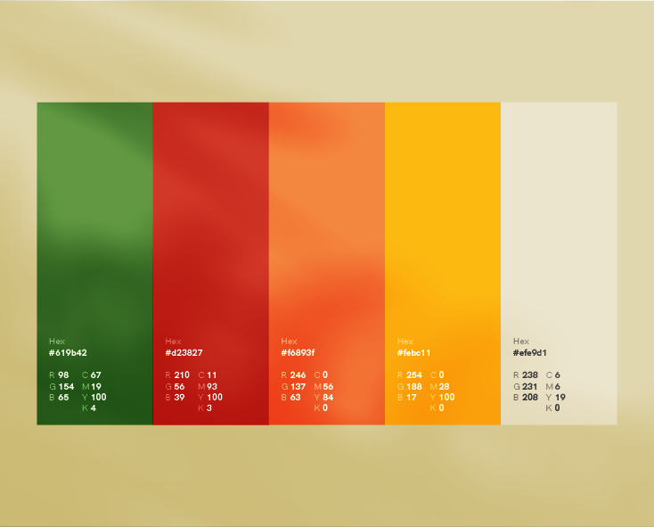
Primary Palette
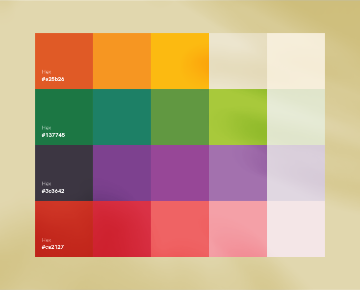
Second Palette
"RubineS does not want to limit ourselves to a single colour palette, we are always ready to explore and try different tones just like how taste can be so variable."
Crafting Visual Delights
Rubines visuals uses an organic design. Elements that do not produce sharp corners, but elements that look natural as a gift from the earth. Shapes of ingredients in its natural state evoke a more natural and trusting feel, showing RubineS start off fresh and bring together ingredients to create a whole dish.
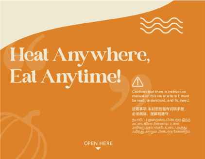
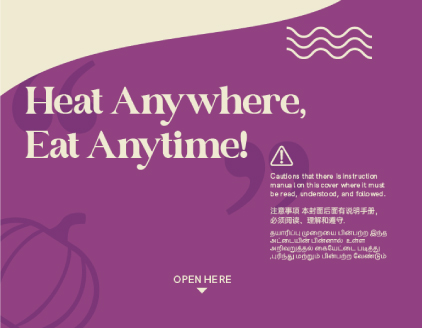
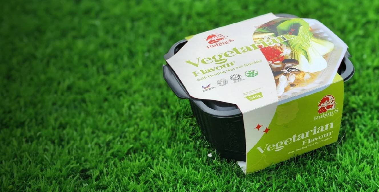
Designs on the sleeve
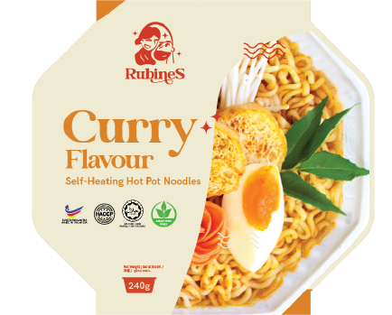
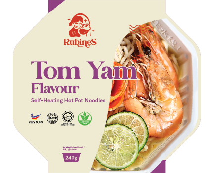
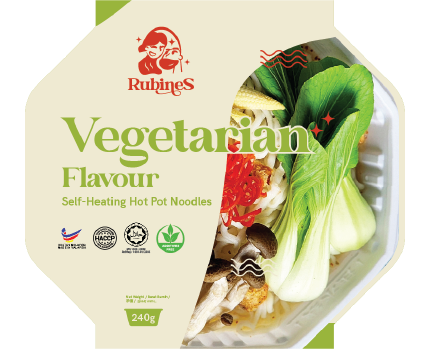
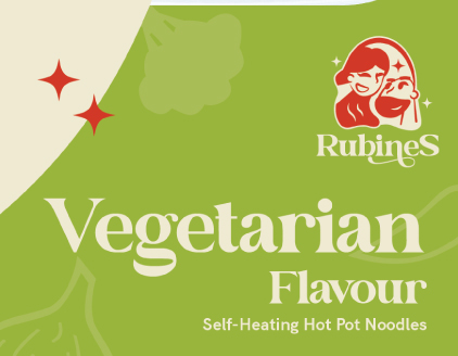
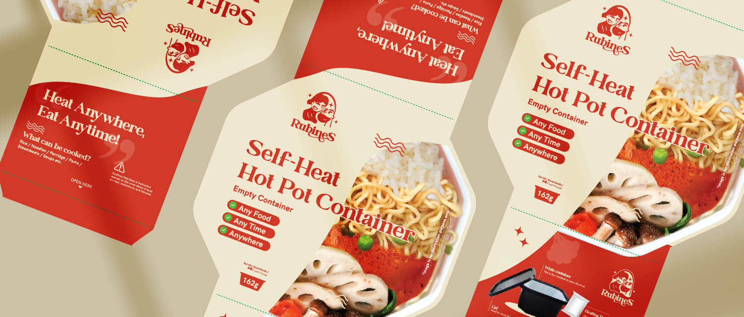
Close-up shots of foods that symbolized each flavour of the noodles at the front of the sleeve.
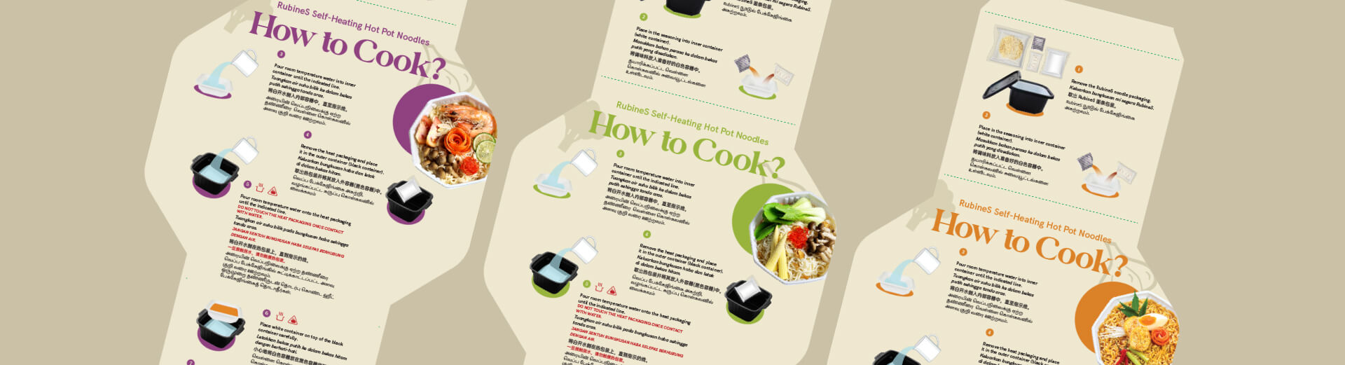
Illustrated trilingual cooking instructions and far shots of foods at the back of the sleeve
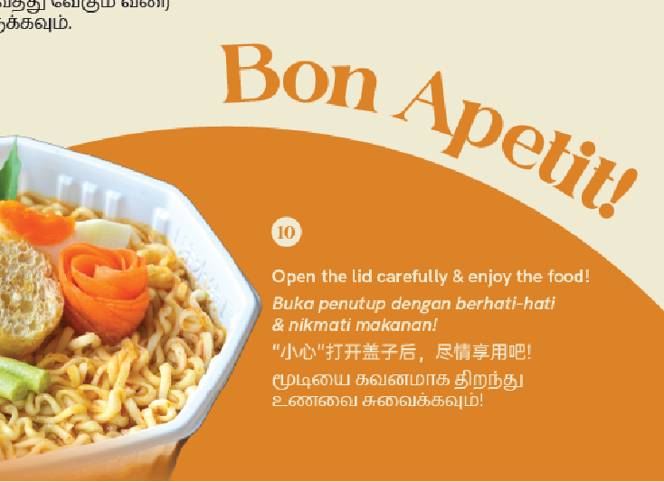
To further evoke an artisan touch, the French phrase “Bon Appétit” was used at the back of the sleeve. This sleeve design included product ingredients and cooking instruction is 3 langauges.
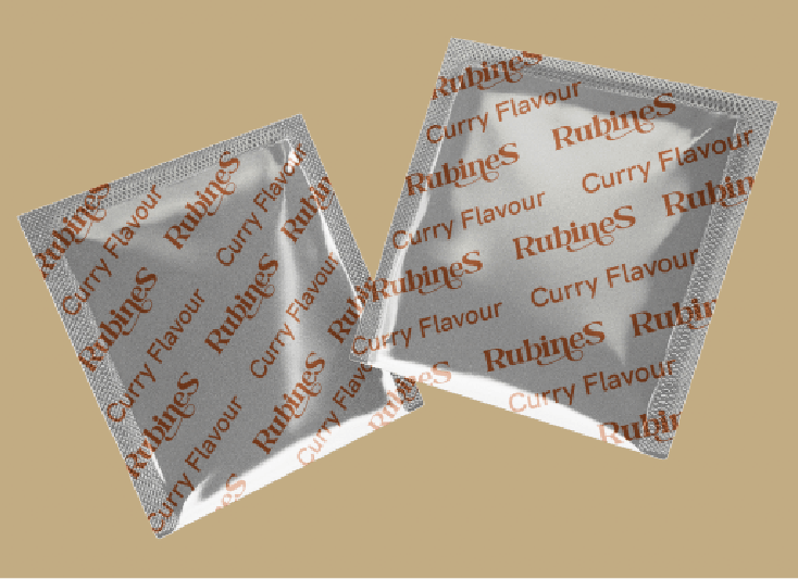
We also created two designs for the powder seasoning sachet and sauce packet
We used Sin Nam Huat’s original Chinese content for their brand story, embracing an authentic tone. Considering Malaysia’s diverse cultural landscape, we then opted to include both English and Chinese for website navigation and content.
RubineS’ Visual Launch
So, here marks the end (for now) of the story about how we brought RubineS to life visually, capturing their startup charm, and setting them on the path to success in a fierce market.