In March 2012, PointzMatter emerged in the Android application market. A loyalty management application forging partnerships across diverse industries, where members redeem rewards and promotions.
Fast forward to July 2022, and many things have changed in a decade. A new generation of consumers, new market expectations and the need for a new brand that could pull both members and merchants in.
Language, the Heart of a Nation
With the intention to connect to the multicultural society even in the rural parts of Malaysia, this rebrand had to speak to its consumers by representing them. Going through approximately 3 rounds of revisions with about 15 brand names in the mix.
We arrive at the name
-taken from the Malay language. Thanks to its Malaysian origin of CardSys Sdn. Bhd.
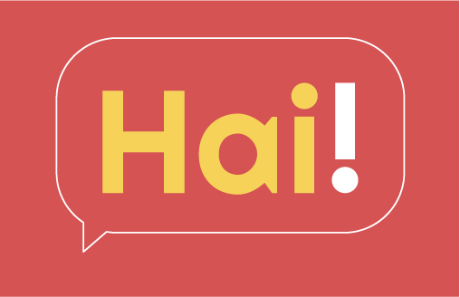
HAi!: Connecting Consumers, Merchants and Rewards
Derived from the Malay word “hairan” (meaning “amazed”), “Hai” mirrored HAi!CO’s commitment to offering an astonishing user experience. “Hai” is also “hi” in Malay. With a unique Malaysian twist, this friendly greeting conveyed a warm welcome from HAi!CO to both general consumers and business owners with open arms.

Part of the brand name
After settling on the name “HaiCo,” we conducted trademark research to confirm its availability for trademarking and as the future domain name for the app’s website.
Unfortunately, we found similar brand names hailing from other countries in various letter cases. Hence, we introduced an exclamation mark after “Hai”. Whilst intensifying the excitement of this multi-vendor reward app, this element also expressed the app’s sheer excitement for having its users on board.
For a playful touch, we intentionally kept the letter “i” in “HAI” in lowercase, forming an inverted motif with the exclamation mark. The unique motif, “i!”, then became a distinctive visual element of HAi!CO.

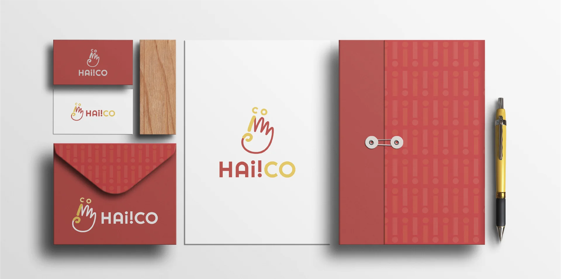
Corporate Motif

Part of the brand name
CO: Community and the Power of Unity
“Hai” is a warm greeting, but it will only come to life when spoken to people. So, here’s the second part of the brand name – CO. Referring to “community of collectors”, “CO” represents the target audiences of this app – merchants and consumers. They were the lifeblood of HAi!CO.
Birthing a Name
- that can be pronounced by all the language audience
- easy to remember
- had a story to tell
- short & sweet
To show HAi!CO’s dedication to fostering mutually beneficial relationships between merchants and consumers,
we created distinct campaign slogans for them.
Merchants: Rewarding your community has never been easier.
In just four simple steps, merchants could seamlessly partner with HAi!CO. Then, they could establish point rewards and gift card systems, run scheduled as well as automated campaigns, and many more ahead, making customer engagement a straightforward and effortless process.
Consumers: Reward collection has never been easier.
For consumers, our goal was to communicate the convenience of HAi!CO, where its services would be accessible anytime and anywhere. To further deepen the connection of this multi-vendor reward app with the consumers,
a brand story was created to breathe life into it.
Brand Story
We initiated the brand story by highlighting common challenges that consumers face with loyalty cards and vouchers. Throughout the story, an informal tone was adopted to match the app’s friendly tone of voice.
Have you ever found yourself in these situations?
Lost your membership card cause you just have too many to fit in your wallet.
The voucher you had expired before you even used it. Any idea where you left it?
Or you are just so tired of plastic cards and waxy paper brochures that pollute the earth?
Transitioning from these challenges, we introduced HAi!CO’s benefits as the ultimate solution to them. This showed the dedication of the app to creating people-centric benefits and being sustainable.
This is a thing of the past with the Hai!Co mobile app.
You can now find rewards from all your favourite stores all in one location (anytime, anywhere).
Never miss a chance to save when you are notified about new promos & we can say goodbye to non-biodegradable plastic cards and printed brochures that just end up in the trash.
The story was then continued by informing the audiences about the app’s rebranding from PointzMatter to HAi!CO. We also weaved some of the new brand values – innovative, collaborative, enthusiastic, and people-oriented – into the brand story to enhance HAi!CO’s brand affinity.
No longer just Pointzmatter, HAi!CO provides convenience with innovative solutions for the community that matters the most to our merchants. We are passionate about rewarding consumers wherever they are.
Finally, the brand story was wrapped up with a compelling call to action. The friendly tone softened the directive, turning it into a gentle reminder that aligned seamlessly with HAi!CO’s welcoming spirit.
Don’t forget to download the app, alright?
Brand Essence
To efficiently etch the brand identity into the minds of its target audiences, we encapsulated the essence of the brand story into the tagline “Rewards Everywhere”.
Yet, we recognized that the impact of words couldn’t surpass that of images, which universally transcend language barriers. With the intention to visually convey the essence of HAi!CO, a new logo was crafted.
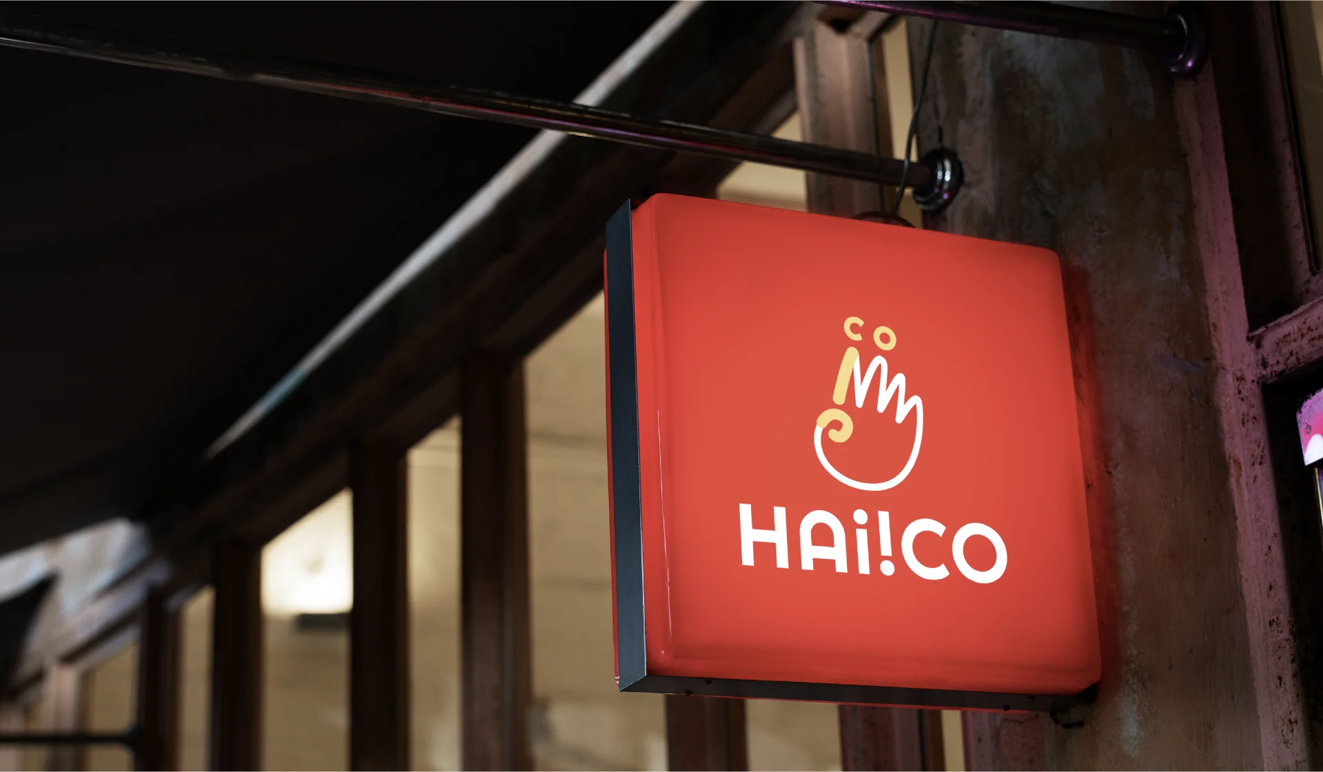
Logo
The elements of the new HAi!CO logo
To efficiently etch the brand identity into the minds of its target audiences, we encapsulated the essence of the brand story into the tagline “Rewards Everywhere”.
Yet, we recognized that the impact of words couldn’t surpass that of images, which universally transcend language barriers. With the intention to visually convey the essence of HAi!CO, a new logo was crafted.

Color Palette
The playful colour palette of red and yellow further imparted a friendly and dynamic feel to the logo.

Logo variations of HAi!CO
To ensure that the logo remained recognizable across a variety of applications, we created several logo variations for HAi!CO.


HAi!CO’s Rebranding Triumph
January 2023 marked a special milestone for HAi!CO. In that month, this multi-vendor reward app made a grand comeback.
In November 2023 (or earlier), HAi!CO has been celebrating its remarkable achievement of more than 10, 000 downloads on the Google Play Store!